October 16, 2025 • 25 min read • By Nick Rackley
Law Firm Website Examples: What Actually Converts (2025)
As a law firm owner or marketing professional, your website is often the first impression potential clients have of your practice. Whether you're a prestigious Big Law firm recruiting top talent or a solo practitioner competing for local clients, your website needs to accomplish three critical objectives to be effective:
- Capture the User's Attention: Imply professionalism with some kind of visually stunning display that immediately grabs attention and communicates credibility
- Quickly Establish Credibility: Use external markers such as news stories, major cases won, client reviews, and industry recognition to prove your expertise
- Clear Call to Action: Make it obvious what the next step is, whether that's "Schedule a Consultation" for clients or "Apply for a Position" for recruits
At Vibe Otter Web Design, we've designed dozens of websites for lawyers and analyzed hundreds more to understand what actually works. In this comprehensive guide, we'll examine 23 real-world examples from Big Law firms to small practices, breaking down what makes each one effective (and what makes some fail).
Article Outline - Click to Jump
KEY ISSUE: Lawyers are trained to think and communicate in text-heavy, detailed language. But here's the truth: your clients don't read like lawyers do. Most website visitors scan, skim, and make decisions based on visual hierarchy and quick credibility markers. If your site looks like a legal brief, you're losing clients before they read a single word. Your website needs to communicate expertise visually first, then support it with substantive content for those who dig deeper.
Big Law Firms: The Gold Standard
Important Note: If you aren't a big law firm, you might not want big law site structure. These sites are just as concerned with recruiting top talent as they are with getting clients. The structure and approach may not be optimal for firms primarily focused on client acquisition.
Big Law websites serve a dual purpose: attracting high-value corporate clients and recruiting top legal talent. These sites set the standard for professional credibility while balancing accessibility. Let's examine what the most prestigious firms in the world do right (and sometimes wrong).
1. Latham & Watkins
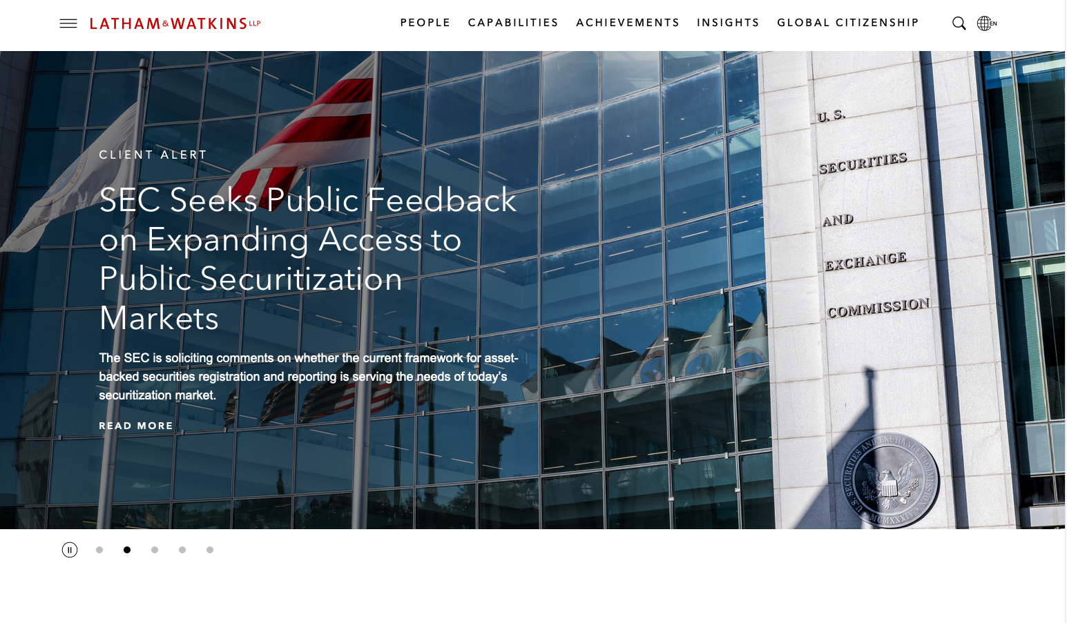
Latham & Watkins, one of the world's most prestigious law firms, demonstrates both the strengths and weaknesses of Big Law web design. Their website reflects the firm's position as a global legal powerhouse, though it's clearly optimized more for recruiting than client acquisition.
What Works Well
Recruiting-Focused Design: The site excels at quickly directing visitors to recruiting pages, which appears to be their primary optimization goal. For a firm of this caliber, recruiting top talent may be more important than client acquisition through the website.
Strategic Content Organization: Latham organizes content by both practice area and industry, recognizing that different audiences search in different ways. A pharmaceutical company looking for IP litigation support can find relevant expertise through either lens, reducing friction in the discovery process.
Where It Falls Short
Poor Visual Hierarchy: The hero section features busy photos with insufficient overlay, making the first text you encounter hard to read. For most firms, this would be a critical flaw. For Latham, their reputation likely compensates for this design weakness.
Key Takeaway: Latham's site works despite visual design flaws because their brand is so strong. Smaller firms should not emulate this approach – you need superior visual design to compensate for lesser brand recognition. Also note how their optimization for recruiting over clients may not match your priorities.
2. Cravath, Swaine & Moore
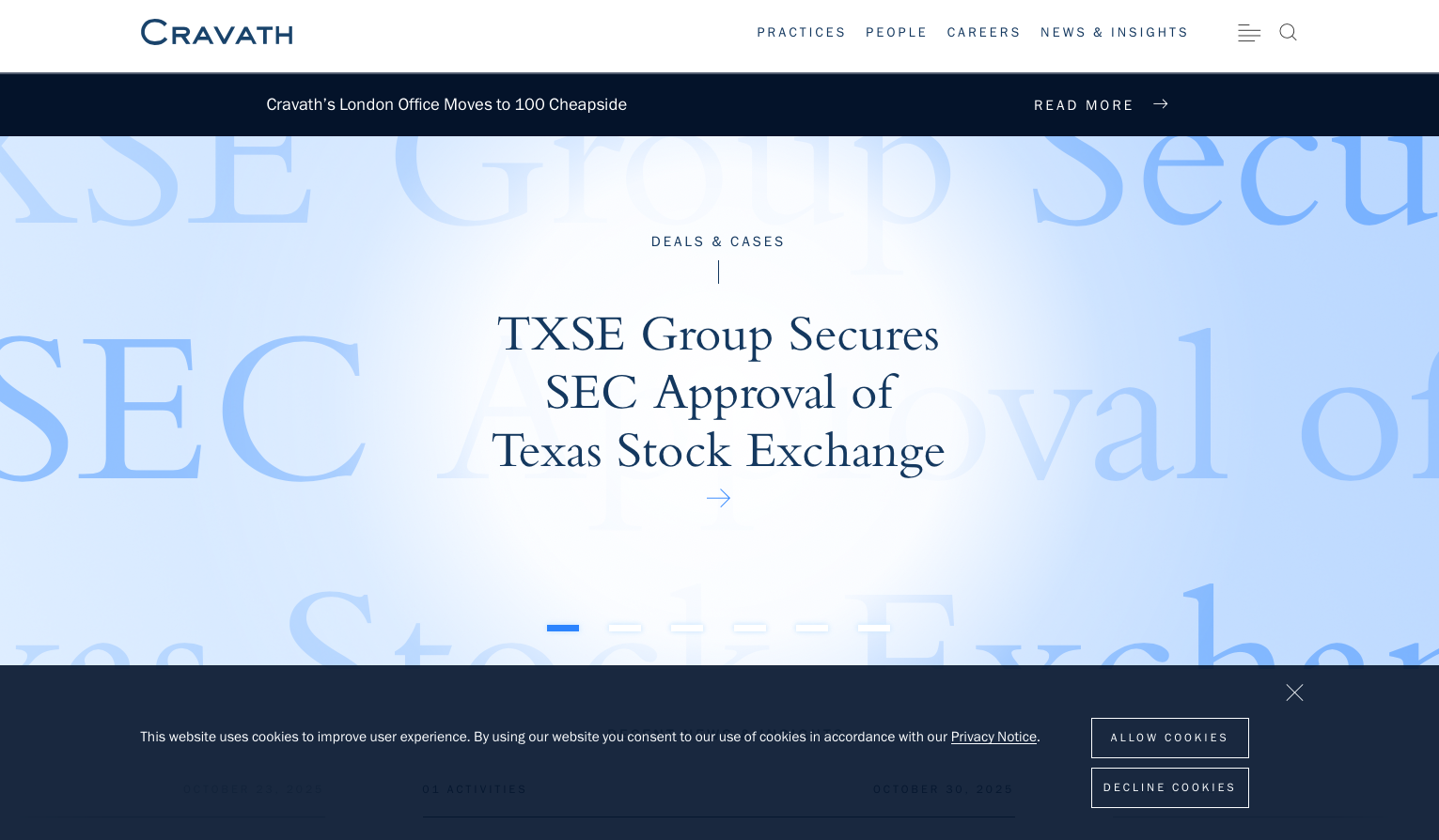
Cravath represents a classic case of "Design by Lawyers." Founded in 1819, Cravath invented the modern law firm associate training model. While their website has a much better visual landing than some competitors, it suffers from excessive text added by partners who don't understand how their clients actually consume web content.
What Works: Much Better Visual Landing: Unlike Latham, Cravath's hero section is visually appealing and doesn't suffer from readability issues. The initial impression is strong and professional.
The Problem: Design by Lawyers: Lawyers typically overfixate on text. The vast majority of your clients are skimming or perhaps not even reading most of the text on your site. This site appears to have been designed well initially, then altered to fit the text-heavy tastes of the legal partners instead of optimizing for actual client behavior. This is the cardinal sin mentioned in our KEY ISSUE above – lawyers think their clients read like they do, but they don't.
Key Takeaway: Cravath's site demonstrates what happens when lawyers don't trust their designers. The visual foundation is solid, but the excessive text added by partners clutters the experience and works against conversion. Their brand prestige allows them to survive this mistake – yours might not. Trust your designer's advice about text hierarchy and length.
3. Wachtell, Lipton, Rosen & Katz

Wachtell Lipton represents the most successful law firm (by profits per partner) in the world, and they have our favorite Big Law website. Unlike Latham and Cravath, this site looks like it was designed by professionals optimizing for a law firm's actual audience, not for the partners' preferences.
Eye-Catching Hero That Works: The visual design immediately grabs attention without sacrificing readability. Professional designers clearly had control over the visual hierarchy here, and it shows.
Instant Credibility Through Stories: After the compelling hero, you immediately encounter stories and news that give instant credibility to WLRK. This is the "quickly establish credibility through external markers" principle in action – they're showing major cases and news coverage, not just telling you they're good.
Clear User Paths: The site quickly directs you to the two things most people are coming for: find an attorney or pursue a career. No confusion, no friction, just clear pathways to the user's goal.
Key Takeaway: This is how Big Law websites should be done. WLRK proves that when you let professional designers optimize for actual user behavior rather than partner preferences, you get a site that both looks stunning and converts effectively. The visual design, credibility markers, and clear CTAs all work together perfectly. If you're building a law firm site, use this as your Big Law reference, not the others.
4. Skadden, Arps, Slate, Meagher & Flom
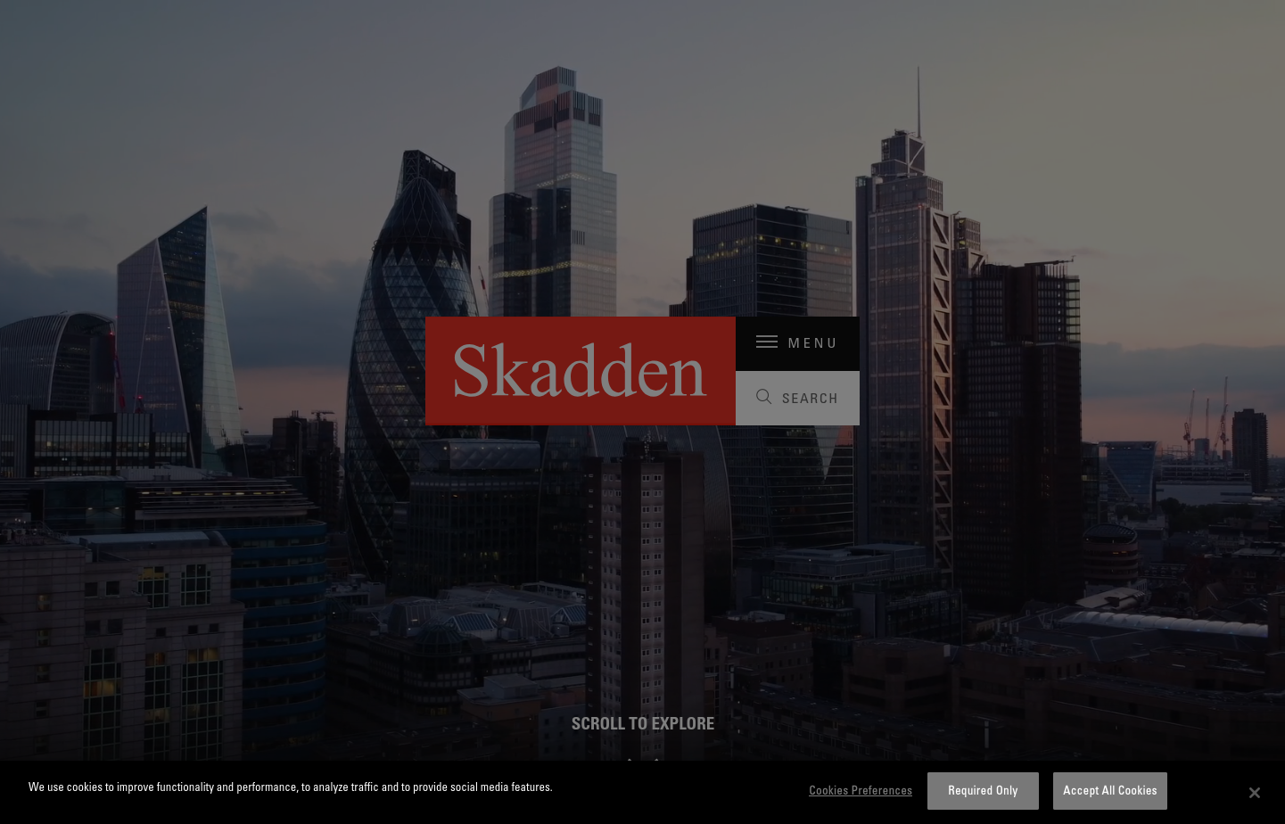
Skadden pioneered aggressive, business-oriented legal representation in the 1970s and 80s. Their website is the most modern and visually appealing of the Big Law designs we've examined, but it doesn't appear to be optimized for driving actual results.
Beautiful But Aimless Design: The visual design is stunning and contemporary, showcasing what Big Law websites can look like when they invest in modern aesthetics. However, beauty without purpose creates problems.
Redundant Credibility Sections: The site has two credibility sections in a row showing off their prestige and accomplishments. A preeminent law firm like Skadden should have one strong credibility section, not multiple redundant ones. This feels like design by committee where everyone insisted their preferred credibility markers be included.
Missing Clear Calls to Action: It's not obvious what to do if you're looking to hire them or if you want to join them. The site fails at the third critical objective we outlined: providing clear calls to action. Visitors are left admiring a beautiful design without knowing what their next step should be.
Key Takeaway: Skadden proves that beautiful design isn't enough. A website needs clear user paths and calls to action, not just visual appeal. Their site looks amazing but fails at conversion optimization. Don't make this mistake – visual design should support user goals, not exist for its own sake.
5. Perkins Coie

Perkins Coie, with deep roots in the Pacific Northwest and a significant technology practice, has a site that seems a little dated visually. The site makes some interesting structural choices that are worth analyzing.
Triple Credibility Sections: The site has basically three sections in a row showing credibility markers – awards, recognition, notable matters, etc. While credibility is important, having three consecutive sections feels excessive and suggests the same "design by committee" problem we saw with Skadden, where different partners insisted on including their preferred credentials.
No Direct Calls to Action: Like Skadden, Perkins Coie lacks clear, direct calls to action throughout the main content. However, their footer navigation is comprehensive enough that a user who scrolls down would quickly be able to find what they need and navigate to relevant sections.
Dated Visual Aesthetic: The overall visual design feels a bit dated compared to more modern Big Law sites. In an industry where visual presentation signals attention to detail and quality, an outdated design can subtly undermine credibility, even for a firm of this caliber.
Key Takeaway: Perkins Coie shows that excessive credibility sections and lack of direct CTAs are common Big Law problems. While their comprehensive footer saves them somewhat, the site would convert better with clearer user paths and a more modern visual refresh. Even established firms benefit from contemporary design that signals they're current and forward-thinking.
Large Law Firms: Professionalism Achievable by Anybody
Key Insight: There's no reason a single lawyer firm couldn't appear digitally like a large firm. Professional web design is about choices, not firm size. These examples prove that sophisticated online presence is achievable for any practice willing to invest in quality design.
Large regional and national firms occupy a unique position: significant enough to handle complex matters but still hungry enough to fight for clients. Their websites often show more creativity and direct conversion focus than their Big Law counterparts.
6. Davis Law Group
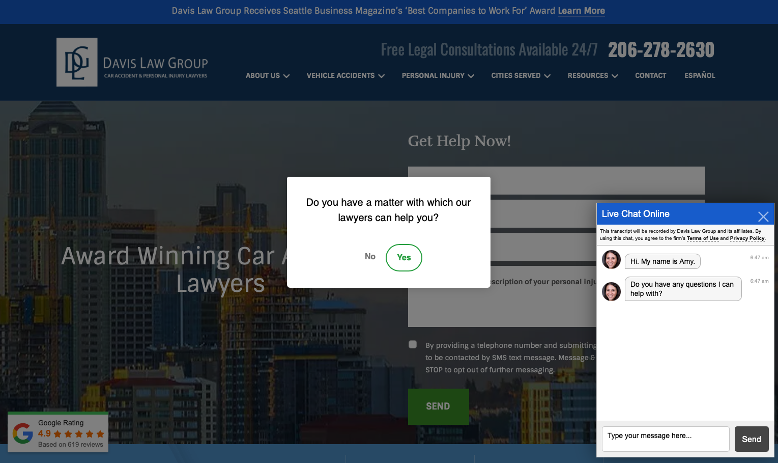
Davis Law Group, a Seattle-based personal injury firm, is an extremely call-to-action heavy site that demonstrates both the power and potential pitfalls of aggressive conversion optimization.
Excessive CTAs: You land on a call to action, have a chat popup, see a phone number, and get a popup asking if you have a matter you want to talk to a lawyer about. This is probably excessive. If a client really did just want to book now, just the hero landing would have worked.
CTAs Distract From Strengths: What all of these CTAs do is serve to potentially antagonize any user who wanted to learn more first. They distract from the fact this business is showing its 619 4.9 Google reviews, which would be very convincing to most people. The social proof is excellent – it just gets buried under CTA overload.
Good Foundation, Poor Execution: The underlying site has strong elements – great reviews, clear value proposition, good content. But the aggressive CTA strategy undermines the trust-building these elements could provide.
Key Takeaway: Davis Law Group shows that you can have too much of a good thing. Multiple simultaneous CTAs don't multiply conversions – they create friction and annoyance. Let your social proof and credibility markers do their work before bombarding visitors with calls to action. Trust that if you build credibility effectively, the CTA will be there when users are ready.
7. Goldberg and Rosen
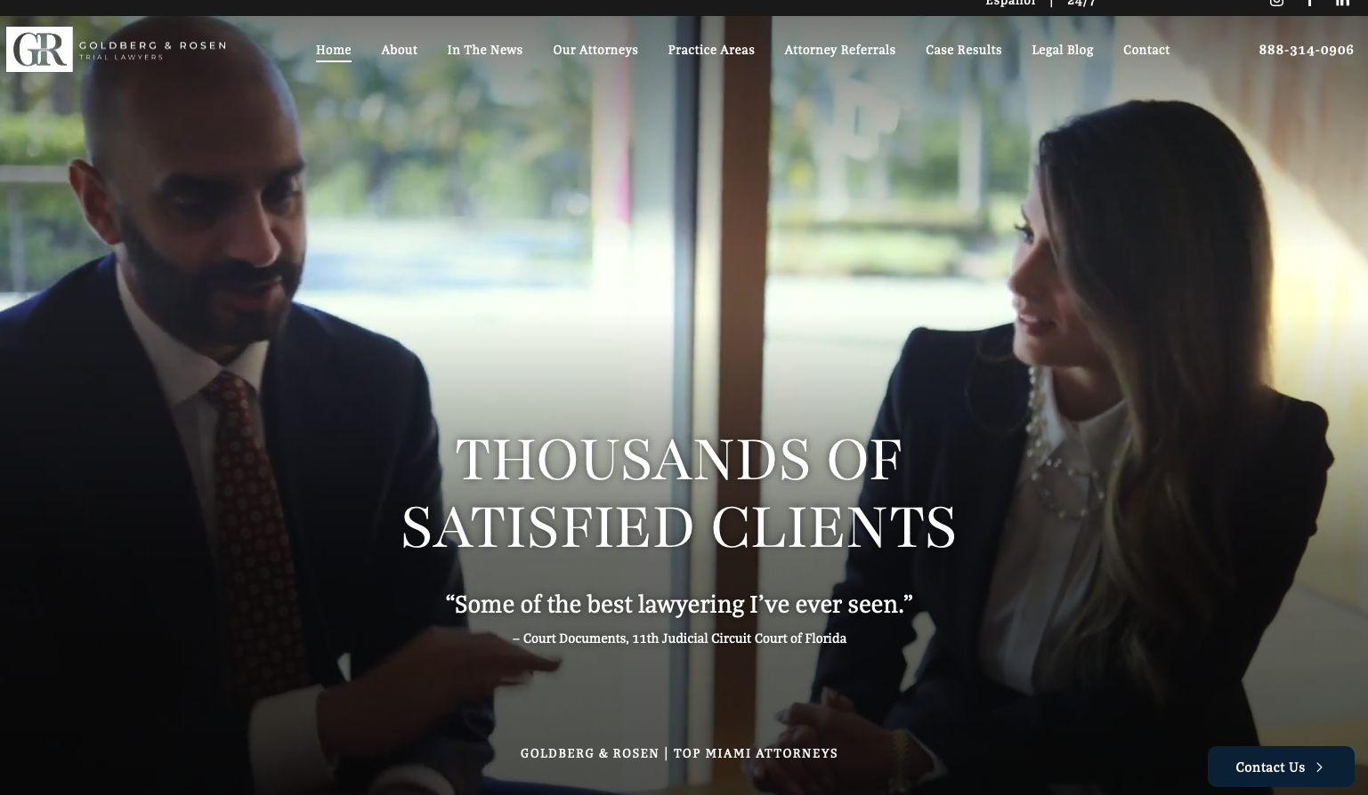
Goldberg and Rosen is the most visually appealing site in the large firm category, and possibly in this entire list. Their approach to credibility-building through social proof is masterful.
Really Effective Background Intro Video: The site features a background intro video showing off their entire law firm in a professional manner. This immediately communicates scale, professionalism, and legitimacy in a way that static images cannot match. The video brings the firm to life and helps potential clients visualize working with them.
Perfect Social Proof with Memorable Quote: The site features this quote: "Some of the best Lawyering I've ever seen" – which would normally be inappropriate or feel like fake testimonial language in such a prominent place. However, it's from an incredibly credible and professional source: an 11th Judicial Circuit Court of Florida judge. This is external credibility markers done perfectly – a memorable, punchy quote from an unimpeachably credible source.
Premium Visual Design: Beyond the video, the overall visual design is sophisticated and refined, communicating that this firm operates at the highest level of professionalism and attention to detail.
Key Takeaway: Goldberg and Rosen demonstrate the power of combining stunning visual design with perfectly executed social proof. The background video solves the "capture attention" requirement, the judge's quote solves "establish credibility," and the clear structure solves "call to action." This is a masterclass in effective law firm web design. Study this site carefully.
8. K Lawson Wellington

K Lawson Wellington demonstrates how modern, dynamic design can set a firm apart. Their website feels more like a tech company than a traditional law firm, which is a strategic choice for attracting contemporary clients.
Bold Visual Identity: The site uses strong typography, dynamic layouts, and contemporary design elements that immediately differentiate the firm from competitors still using traditional legal aesthetics. This modern approach appeals to younger, innovation-focused clients.
Clear Service Communication: Despite the modern design, the site maintains clarity about services offered and expertise areas. The firm doesn't sacrifice substance for style, but rather uses design to make substantive information more engaging.
Key Takeaway: K Lawson Wellington shows that breaking from traditional legal aesthetics can be a powerful differentiator. However, this works because the design supports rather than obscures clear communication of value.
9. Greg Smith Law
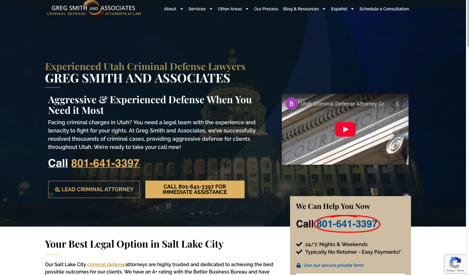
Greg Smith Law exemplifies personal branding in legal practice. The site centers on the founding attorney's expertise and personality, creating connection and trust with potential clients.
Personal Connection: By featuring the attorney prominently and communicating his background and approach, the site creates trust and familiarity. For clients choosing between faceless firms, this personal touch can be decisive.
Niche Focus: The site clearly communicates specialization in specific practice areas, which builds credibility. Potential clients seeking an expert prefer specialists over generalists, and this focused positioning attracts higher-quality leads.
Key Takeaway: Greg Smith Law demonstrates that personal branding works powerfully for solo and small firms. By creating genuine connection and demonstrating specific expertise, the site builds trust efficiently.
10. Coffer & Connelly
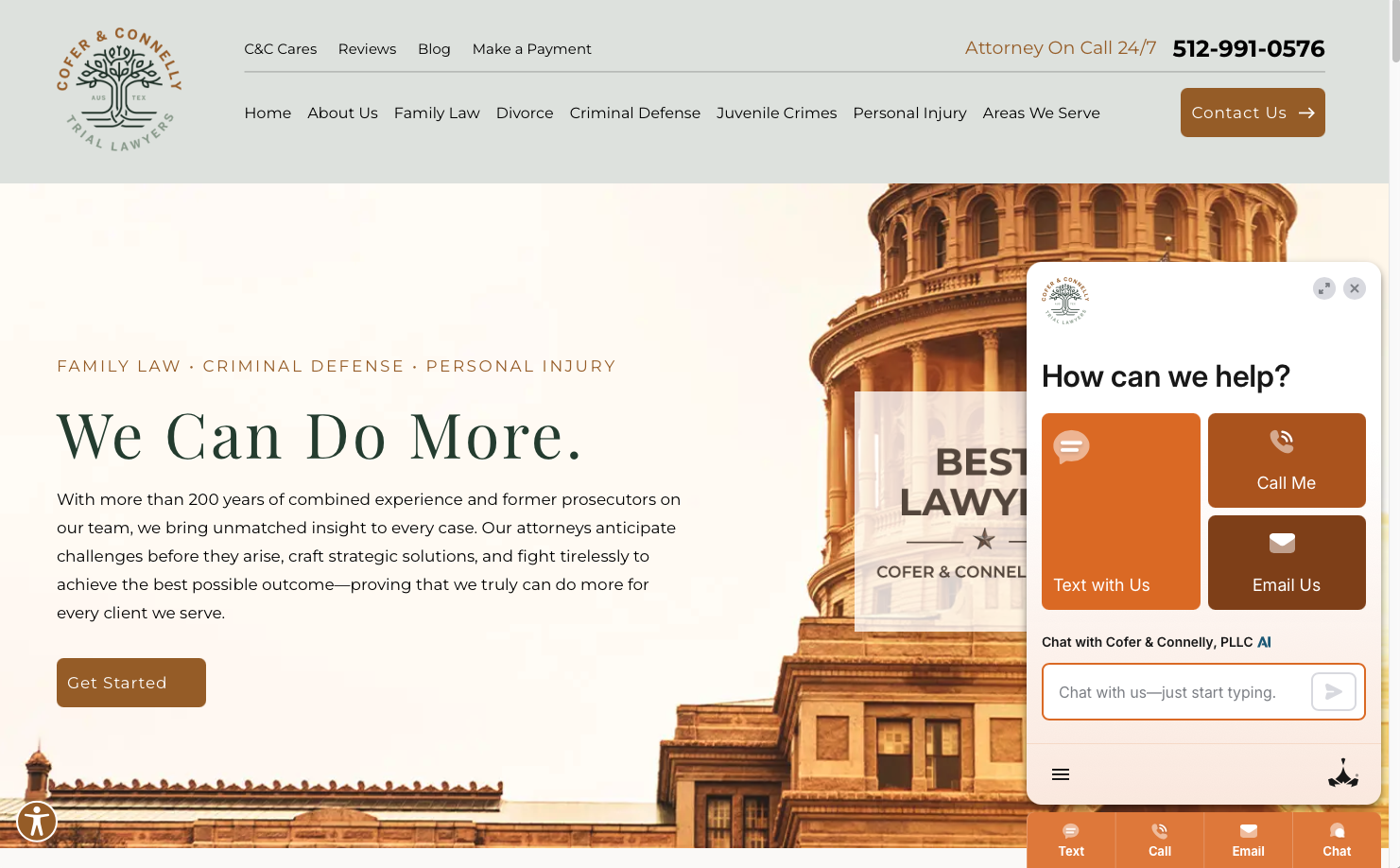
Coffer & Connelly represents a boutique litigation firm with sophisticated branding. Their website successfully communicates both accessibility and high-level expertise.
Professional Sophistication: The design strikes a balance between approachable and authoritative, making the firm feel both competent and accessible. This dual positioning broadens appeal across different client types.
Case Results Emphasis: The firm prominently showcases successful outcomes, understanding that litigation clients primarily care about winning. This results-focused approach addresses client concerns directly.
Key Takeaway: Coffer & Connelly show how boutique firms can create sophisticated online presences that compete with larger rivals. Their focus on results and clear communication of expertise drives effective conversion.
11. Hoglund Law
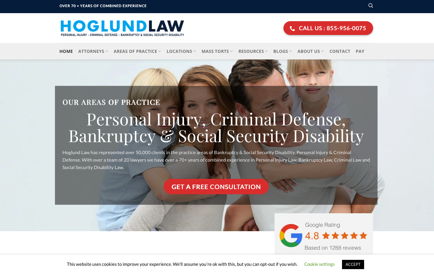
Hoglund Law demonstrates how personal injury firms can create sophisticated, modern websites that convert effectively while maintaining professionalism and credibility.
Modern Design Approach: The site employs contemporary design elements and clean layouts that feel fresh and professional. This modern aesthetic helps the firm stand out in a crowded personal injury market often dominated by dated, aggressive marketing.
Trust-Building Elements: Strategic use of testimonials, case results, and attorney credentials builds confidence with potential clients who are often making one of the most important legal decisions of their lives.
Key Takeaway: Hoglund Law proves that personal injury firms can compete through superior branding and modern design rather than just aggressive marketing. Their approach attracts more sophisticated clients who value professionalism.
Small Law Firms: Examples of Good and Bad
Learning from Contrast: We've deliberately mixed good and bad examples in this section. The differences are striking and instructive. Some examples show that small firms can create professional, credible sites with the right approach. Others demonstrate common pitfalls that hurt credibility and conversions.
Note on DIY: Some examples below used traditional drag-and-drop builders (Squarespace, WordPress, Wix). Modern AI builders can produce more professional results without requiring design skills, and many lawyers find verbal interaction easier than visual design tools.
Small firms and solo practitioners face unique challenges and opportunities. Their websites need to punch above their weight class, creating credibility and trust while showcasing specialization.
12. Malcolm Law Firm
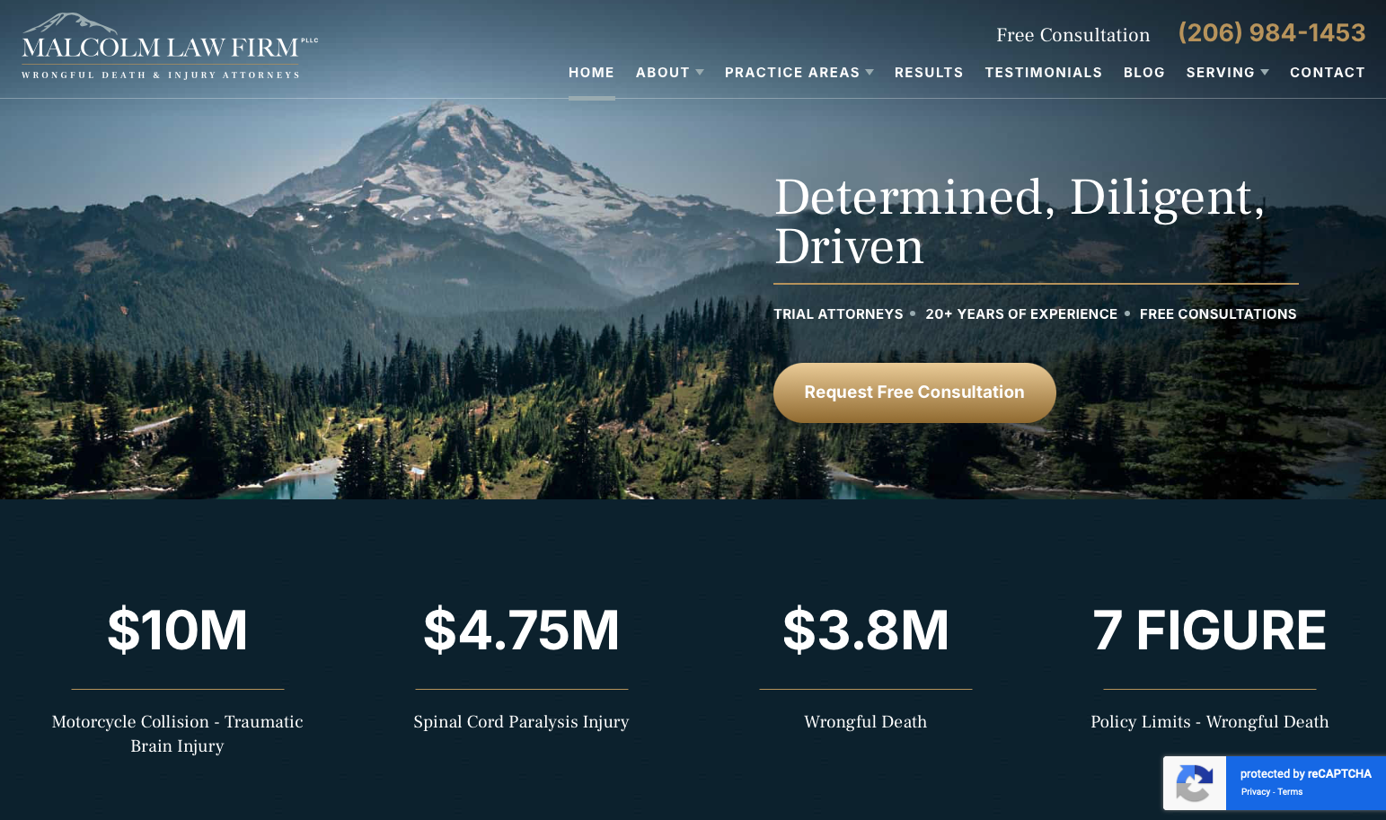
Malcolm Law Firm is a really good example of a small law firm site. It demonstrates how small practices can create professional, effective websites without massive budgets.
Visually Attractive with Localized Visuals: The site is visually appealing and uses localized imagery that helps potential clients connect with the firm. The visual design immediately communicates professionalism and attention to detail.
Good Balance Between Social Proof and CTAs: Unlike Davis Law Group's excessive CTAs, Malcolm strikes the right balance. Social proof and credibility markers are prominent, with calls to action available but not overwhelming. This respects the user's journey from curiosity to decision.
Good Layout for Quick Information Access: The site layout makes it easy for users to quickly get more info or find proof like testimonials. Everything a potential client might want to see is accessible without hunting through multiple pages.
Key Takeaway: Malcolm Law is an excellent template for small law firms. Visually attractive design, localized imagery, balanced social proof and CTAs, and intuitive navigation – all the elements you need without excessive complexity or cost. This proves small firms can create truly professional web presences.
13. Rust Injury Law
Rust Injury Law is a good example of a high-quality DIY site that can be made with AI builders now. This demonstrates what's possible when you use modern tools designed for creating professional sites without extensive design skills.
Professional Visual Design: Despite being a DIY site, the visual design looks professional and polished. This is what separates modern AI builder outputs from drag-and-drop builder sites – the AI handles visual design principles automatically.
Empathetic Messaging with Clean Layout: The site speaks directly to injured people's concerns with an empathetic approach, all within a clean, uncluttered layout that guides users naturally through the content.
Action-Oriented Without Being Aggressive: Clear calls to action are present but not overwhelming. The site strikes the balance between being accessible to injured people who need immediate help and respecting users who want to learn more first.
Key Takeaway: Rust Injury Law proves that modern AI builders can create truly professional-looking law firm websites. If you're considering DIY to save money, use tools like AI builders that compensate for lack of design skills, rather than drag-and-drop builders that require you to make visual design decisions you may not be equipped to make.
14. Peakstone Law Group
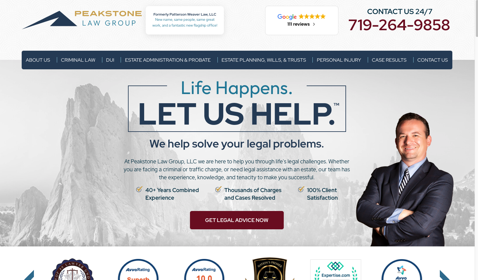
Peakstone Law Group brings modern, sophisticated design to small firm practice. Their website demonstrates how newer firms can establish credibility and compete through superior branding.
Contemporary Design: The site employs modern design trends and visual elements that make the firm feel current and innovative. This contemporary approach attracts clients who value modern thinking and methods.
Professional Positioning: Despite being a newer or smaller firm, the website creates an impression of established competence through design quality and content substance. This positioning helps overcome the credibility gap small firms often face.
Key Takeaway: Peakstone shows that newer firms can establish strong market positions through superior branding and design. Your website can be your most powerful competitive advantage when you're still building reputation.
15. Mette, Evans & Woodside
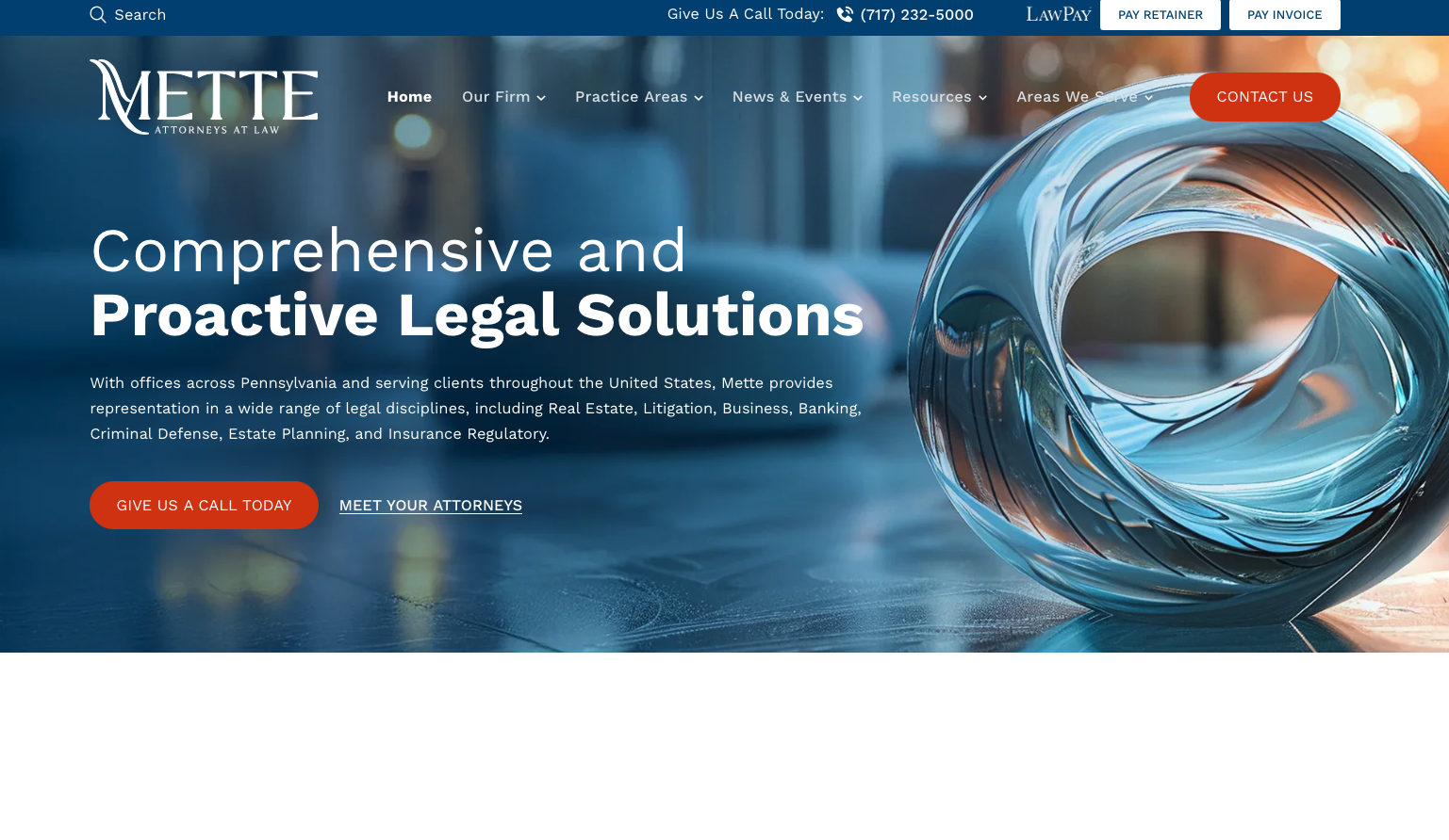
Mette, Evans & Woodside demonstrates how small firms can create sophisticated online presences that communicate both expertise and accessibility. Their website balances professionalism with approachability.
Balanced Presentation: The site successfully communicates competence without feeling intimidating, making it accessible to regular people facing legal issues. This approachable professionalism broadens their potential client base.
Clear Expertise Communication: Practice areas and attorney credentials are presented clearly, helping potential clients quickly assess fit. This transparency builds trust and improves lead quality.
Key Takeaway: Mette, Evans & Woodside show that small firms can create websites that feel both professional and welcoming. This balance is key for attracting clients who want expertise without intimidation.
16. Sand Injury Law

Sand Injury Law creates a focused, conversion-oriented website that speaks directly to injured clients' needs. Their approach demonstrates effective personal injury marketing for small practices.
Results Focus: The site emphasizes outcomes and client success stories, addressing the primary concern of personal injury clients: can you win my case and get me fair compensation?
Accessibility Emphasis: Clear contact information, contingency fee messaging, and easy navigation remove barriers to engagement. The site makes it simple for injured people to take action.
Key Takeaway: Sand Injury Law demonstrates that effective personal injury websites focus relentlessly on what clients care about: results, accessibility, and no upfront costs. By addressing these concerns directly, small firms can compete effectively.
17. LIF Law
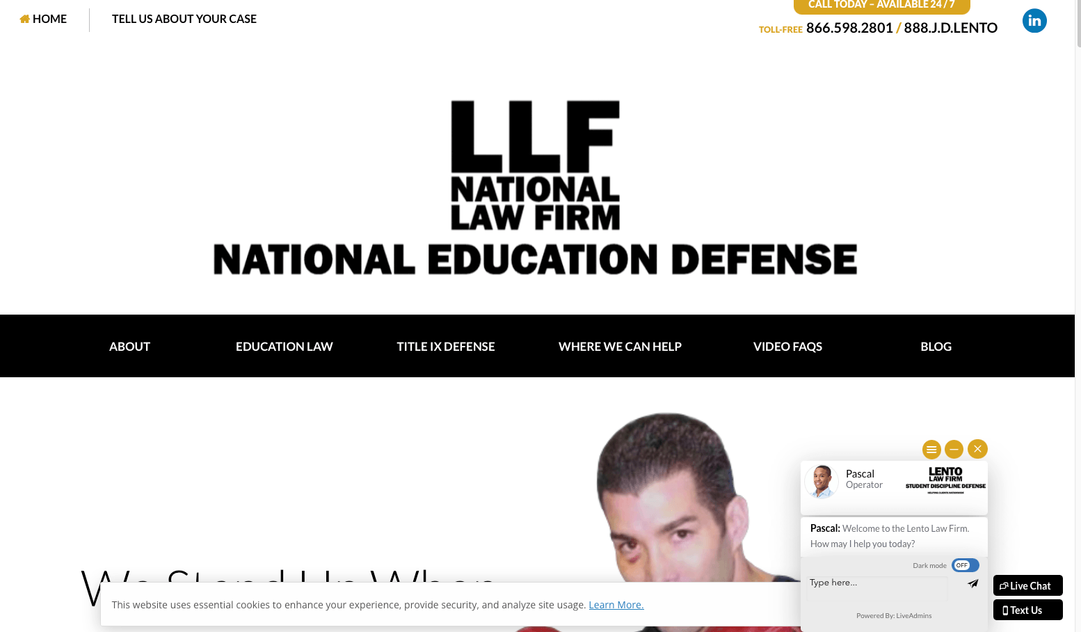
LIF Law has a very text-heavy site with an odd layout that illustrates common design challenges.
Text-Heavy Approach: The site has significantly more text than most visitors will engage with, creating a cluttered experience that can overwhelm potential clients.
Unconventional Layout: The layout doesn't follow standard web design conventions, making navigation less intuitive than it could be.
Lacks Visual Hierarchy: Without clear visual hierarchy, it's difficult for visitors to quickly identify the most important information.
Key Takeaway: This site shows how challenging it can be to create effective web design without professional help or tools that automate design decisions. Visual hierarchy and standard layout patterns help users find what they need quickly.
18. CMS Law Firm
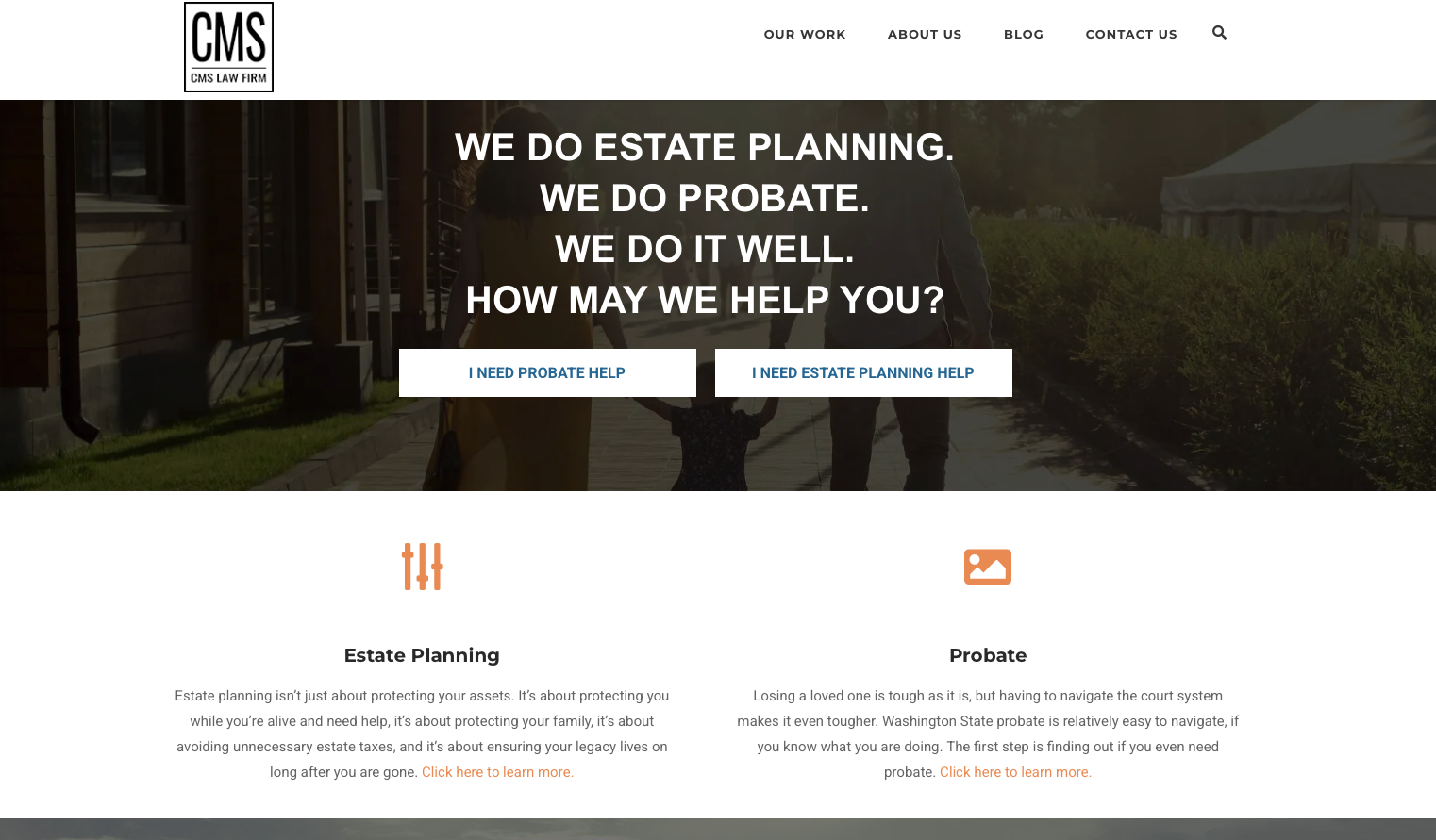
CMS Law Firm is not the prettiest site, but it has quite an effective layout that demonstrates you don't always need stunning visuals to have a functional website. However, it has one critical flaw.
Effective Layout Despite Limited Visual Appeal: The site's layout is logical and functional, making it easy for potential clients to navigate and find information. The structure works well for a general practice firm serving diverse clients. This shows that good information architecture can partially compensate for limited visual design.
Critical Flaw: Completely Lacks Social Proof: The site completely lacks any social proof or markers of credibility. No client testimonials, no case results, no awards or recognition, no reviews. For a site that otherwise has decent bones, this is a fatal mistake. Remember our framework: you need to quickly establish credibility through external markers. CMS provides none.
Clear Organization: Despite serving multiple practice areas, the site maintains clear navigation. If they added strong social proof elements, this would be a solid small firm site.
Key Takeaway: CMS Law Firm shows that effective layout and organization matter, but they're not enough. Without social proof and credibility markers, potential clients have no external validation to trust you. Even if your visual design is limited, you MUST include testimonials, reviews, case results, or other markers that prove your competence. Don't make CMS's mistake.
19. John Rongerude Law Office
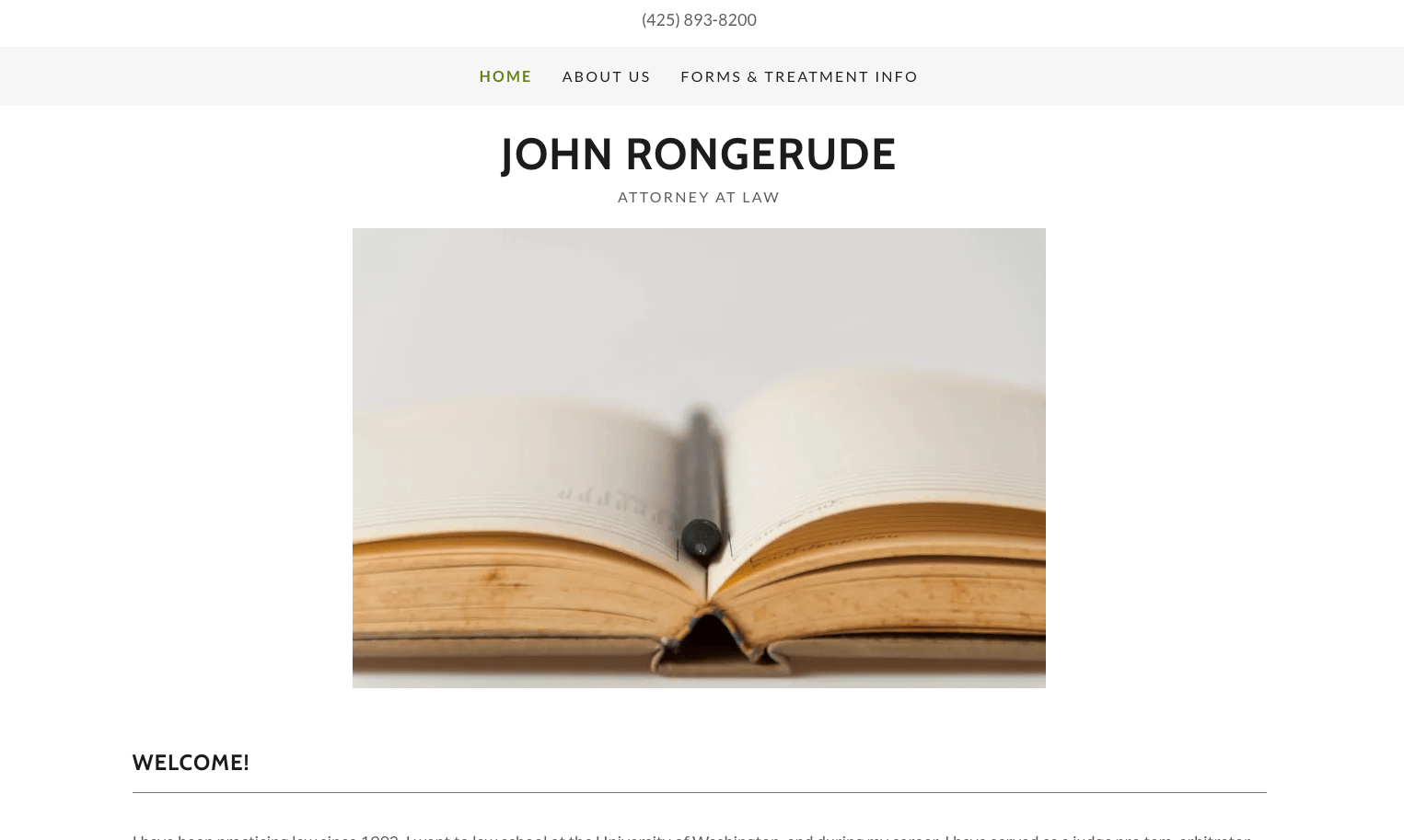
John Rongerude Law Office uses a basic template approach that illustrates some challenges with DIY website building.
Generic Template: The site uses a standard template layout that doesn't differentiate the firm from others using similar designs.
Text-Heavy Content: Like some other examples, this site has more text than most visitors will read, which can dilute key messages.
First Impression Matters: Your website is often a potential client's first impression. The visual presentation should communicate the same professionalism as meeting in person.
Key Takeaway: When building a site yourself, consider tools that help with design decisions automatically. Professional visual presentation is important for establishing credibility with potential clients who don't yet know your work.
20. Seigman Law
Screenshot not available
Seigman Law creates a focused, professional website that communicates expertise in specific practice areas. Their approach demonstrates how specialization can be a powerful marketing tool for small firms.
Specialization Focus: By clearly emphasizing specific practice areas, the site attracts clients looking for specialists rather than generalists. This focused positioning often allows small firms to command higher fees.
Credibility Building: The site strategically presents credentials, case results, and other trust markers that overcome the credibility gap small firms sometimes face when competing with larger rivals.
Key Takeaway: Seigman Law demonstrates that clear specialization and strong credibility markers help small firms compete effectively. Potential clients seeking experts often prefer focused specialists over large general practice firms.
21. McShane Law

McShane Law demonstrates effective criminal defense marketing through focused, credibility-driven web design. Their site speaks directly to the concerns of people facing criminal charges.
Specialized Messaging: The site speaks directly to criminal defendants' concerns and fears, creating immediate relevance and connection. This targeted approach attracts qualified leads.
Experience Emphasis: By prominently featuring the attorney's background and case experience, the site addresses the fundamental question criminal defendants have: can you protect me?
Key Takeaway: McShane Law shows that effective criminal defense marketing requires understanding your audience's emotional state and addressing their specific fears. Generic legal messaging doesn't work when clients are facing life-changing consequences.
22. Schweikert & Goldberg
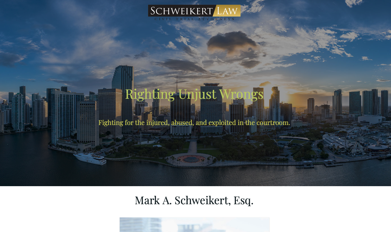
Schweikert & Goldberg creates a professional, credible online presence that communicates both expertise and accessibility. Their site demonstrates effective small firm positioning.
Professional Design: The site employs clean, modern design that communicates competence without excessive formality. This balanced approach appeals to clients seeking expertise without intimidation.
Clear Value Communication: Practice areas and attorney expertise are presented clearly, helping potential clients quickly determine if the firm is right for their needs. This transparency improves conversion quality.
Key Takeaway: Schweikert & Goldberg demonstrate that small firms can create professional websites that compete with larger rivals by focusing on clear communication and modern design rather than trying to look bigger than they are.
23. Monument Legal Group
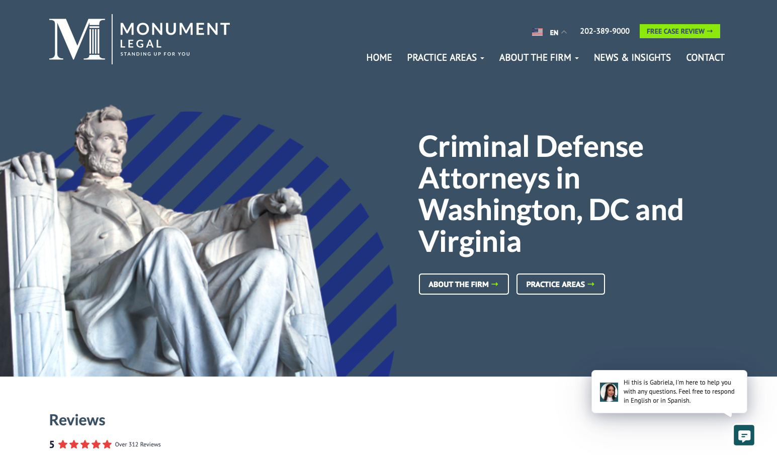
Monument Legal Group brings contemporary design and clear positioning to small firm practice. Their website demonstrates how modern branding can help newer firms establish strong market positions.
Contemporary Branding: The site employs modern design elements and branding that make the firm feel current and innovative. This contemporary approach helps attract clients who value forward-thinking legal counsel.
Clear Positioning: The firm communicates its unique approach and values clearly, helping attract culturally aligned clients. This values-based positioning creates stronger client relationships and higher retention.
Key Takeaway: Monument Legal Group shows that newer firms can establish strong positions through superior branding and clear values communication. Your website can help define who you are and attract clients who appreciate your approach.
Conclusion: Key Takeaways for Law Firm Websites
After examining 23 law firm websites across the spectrum from Big Law to solo practices, several critical success factors emerge:
- Know Your Audience: Big Law sites serve corporate clients and recruits. Personal injury sites serve injured individuals. Your design, messaging, and content should align precisely with who you're trying to attract.
- Visual Hierarchy Matters: Most visitors scan rather than read. Use design to communicate professionalism and credibility before they read a single word. Your visual presentation is often more important than your copy.
- Credibility Markers Are Essential: Whether it's case results, client testimonials, news coverage, or professional credentials, you need external validation. Self-promotion without proof falls flat.
- Specialization Beats Generalization: Firms that clearly communicate focused expertise attract higher-quality clients willing to pay premium rates. Being everything to everyone dilutes your message.
- Clear Calls to Action: Whether it's "Schedule Consultation" or "Apply Now," your visitor should always know the next step. Remove friction from engagement.
- Mobile Optimization Is Non-Negotiable: Increasing numbers of potential clients research lawyers on mobile devices. If your site doesn't work perfectly on phones, you're losing clients.
- Content Should Support, Not Dominate: Yes, lawyers love detailed analysis. But your website should lead with visual impact and clear messaging, then offer depth for those who want to dig deeper.
The most effective law firm websites share one critical trait: they understand that different clients have different needs and make decisions differently. Big Law clients are sophisticated buyers making rational decisions based on expertise and reputation. Personal injury clients are often scared, confused individuals making emotional decisions about who they can trust. Your website must align with how your specific clients think and decide.
Ready to Create a Law Firm Website That Converts?
At Vibe Otter, we specialize in creating law firm websites that don't just look professional – they drive real business results. Whether you're Big Law, boutique, or solo practice, we'll create a site that attracts your ideal clients.
Get Your Custom Law Firm Website